
Brand
Marcus brand guidelines
The logo, the colours and the typeface, with the rules that keep them recognisable. Everything on this page is free to use when you are writing about Marcus, linking to us, or listing us in a directory.
Logo
Two forms. The wordmark is the primary logo — reach for it first. The icon is for square spaces where the wordmark would be illegible: avatars, favicons, app tiles.
Wordmark
Icon
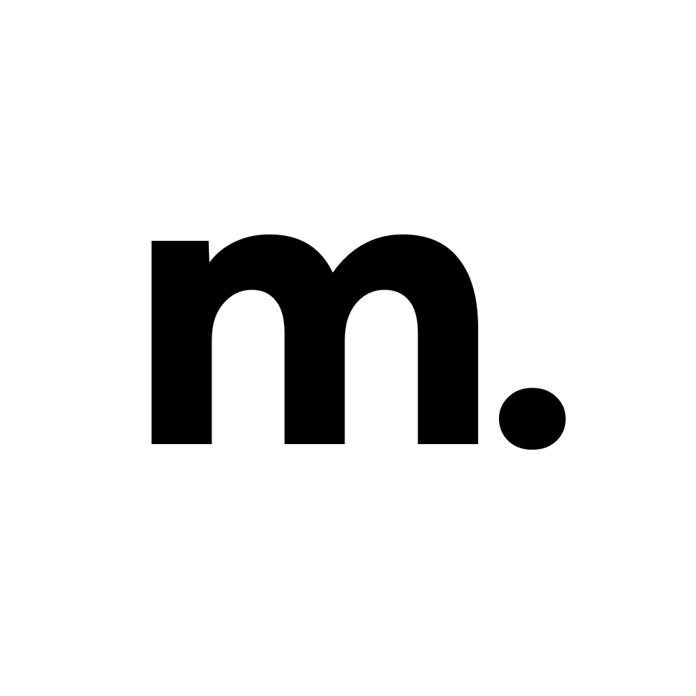

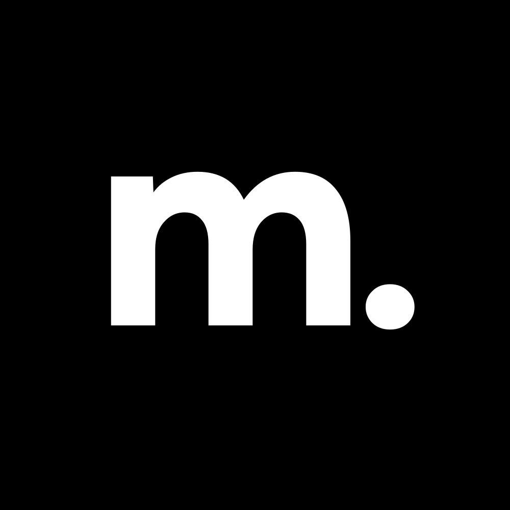



SVG is the master — use it wherever vectors are accepted, and it will stay sharp at any size. The PNGs are 1500 × 616 (wordmark) and 1000 × 1000 (icon).
Clear space & minimum size

Keep clear space of x on all four sides, where x is half the height of the wordmark. Nothing enters that box — no type, no rules, no image edges.
64px wide min.

24px min.
Below these sizes the counters in the m close up and the full stop disappears. In print: 20mm wide for the wordmark, 8mm for the icon.
What not to do
- Do not stretch or squash the logo — scale it proportionally.
- Do not recolour the mark. Use one of the variants above.
- Do not add effects, shadows, gradients or outlines.
- Do not rotate or tilt it.
- Do not rebuild the wordmark by typing “marcus.” in a font.
- Do not place it on a busy or low-contrast background.
Colour
One accent on a black-and-white base. The blue is a highlight, not a background — it earns its weight by being rare.
-
Marcus Blue
#0048DE
rgb(0, 72, 222)
The accent, and the only brand colour. Eyebrows, links, highlights, focus rings. Never a large fill.
-
Black
#000000
rgb(0, 0, 0)
Page background. The brand’s default surface.
-
Black 2
#1B1B1B
rgb(27, 27, 27)
Cards and panels raised off the page.
-
White
#FFFFFF
rgb(255, 255, 255)
Body text on black. Primary button fill on dark.
-
White 2
#F7F7F7
rgb(247, 247, 247)
Light-theme panels. Button hover on dark.
-
Grey
#7F7F7F
rgb(127, 127, 127)
Secondary text: subtitles, captions, muted labels.
Typography
One typeface, everywhere: Helvetica Neue. Weight and size carry the hierarchy — a second family never does.
Aa
font-family: "Helvetica Neue", Helvetica, Arial, sans-serif;
-
Marcus completes the work.
400 · Regular
All headings, hero titles and body copy. Headlines are not bold — this is the rule people miss most.
-
Marcus completes the work.
500 · Medium
Buttons, eyebrows, labels, and emphasis inside body copy.
-
Marcus completes the work.
700 · Bold
Rare. Only where a single word has to cut through a dense block. Never a whole heading.
Using the Marcus name
Write it as Marcus — capital M, no other styling. The logo sets it in lower case; running text does not.
You may use these assets to refer to Marcus: in articles, reviews, comparisons, integration listings and documentation. You do not need to ask first.
You may not use them in a way that suggests we built, endorsed or partnered on something we did not — including in your own product name, logo, icon or domain.
Marcus is a product of Zavo LTD. Not sure whether your use is fine? Ask us — we answer quickly.